
Content management system + brand website design
Client
Thoughtworks
Duration
4 years
ongoing
Team size
30 -40
Role
Lead Experience
designer
Budget
~
What was the project about ?
It was about redesigning of Thoughtworks.com (main website of org) and implementation of new CMS (content management system) on which this website is built and operates.
What work i did ?
On a high level, work on this project can be divided in two parts, as shown in the image below. The first part was working on CMS (content management system) itself, which was used by page authors and content creators to create pages for the website. It involved, working on designing components and page templates in the old as well as new CMS. The second part was improving the overall user experience for the website.

Worked on old CMS system till it was retired
Initial work was for setting up new CMS and designing page templates as well as training guide for page authors
Majority work done for this
Work - year by year

This was one of the very crucial step for website and Thoughtworks as company itself. Thoughtworks has always known for its Inclusive practices and our website was in need to reflect the same digitally, specially after brand refresh.
This was one of the biggest initiatives taken from the CMS team before Thoughtworks went public. In a very short period of time, we successfully completed the redesign of the website as per new branding
Educating stakeholders, advocating about accessibility and Mentoring team in application of digital accessibility was one of the biggest learning for me.
What were we trying to achieve ?
We were trying to redesign of Thoughtworks.com main website for better lead generation, updated branding and ease of content creation. We were also sunsetting the old CMS ( hacienda ) and implementing the new CMS ( AEM - Adobe experience manager ) on which this website is built and operates.
What did we achieve ?
- Implemented new Content management system.
- Redesigned website as per new branding (in 2021 Thoughtworks went public and did a rebranding which included visual change of all brand related touchpoints including website. )
- Improved Candidate experience in recruitment process (India region)
- Improved lead generation at start of the funnel by redesigning key pages like what we do, service lines, who we work with etc.
- Establish digital accessibility as a standard practice in the team and improved the website's digital accessibility maturity from WCAG 2.0 'A' to WCAG 2.1 'AA'.
- Created a framework for training of how to use new CMS and mentored content authors in how to create accessible content.
How much lead generation we improved ? We were able to improve the start of the funnel, which increased the number of people submitting their email for business inquiries by approx 40%.
How work used to happen ? ( process )
A typical day or sprint in this project looked something like below.

This process was followed for designing templates in CMS as well as designing website.
Click on image to open in zoomed version*
What sections and initiatives i worked on and how ( process ) ?
There are 7 main sections, 20+ subsections, more than 60 unique pages and 30+ components which have been designed till now in Thoughtworks.com website. We followed different research processes for different sections. Following are some of the initiatives and sections which were taken, designed / redesigned by team and the details of research methodologies team used for it.
1. Main navigation redesign
- Competitor research
- Card sorting
- Wireframing
This was one of the initial tasks we had taken, due to requirement of marketing team to add of many newer subsection or subtitles to the website menu.
2. 'What we do' section redesign, service line page template design
- Competitor research
- data analytics
- Wireframing
- Visual design
- journey mapping
3. Client stories / success stories page template redesign.
- Competitor research
- data analytics
- Wireframing
This was one of the sections which was needed to be redesigned before Thoughtworks IPO. Here we did card sorting to understand how our users group some of the menu items.
4. About us section redesign
- Competitor research
- Card sorting
- Stakeholder interviews
- data analytics
- Wireframing
- Visual design
Tech radar and looking glass are Thoughtworks's bi-yearly tech publications / tools. These have been monumental in building the organization's brand and image in the tech community.
5. Insights section redesign
- Stakeholder interviews
- Content author interviews
- Blogs pages template design
- Articles pages template design
- Podcast pages template design
- Tech radar redesign
- Looking glass (digital tool) design
- Search functionality design
- data analytics
- Wireframing
- Visual design
I played a crucial role in mentoring many of the team members including stakeholders, directly and indirectly by giving presentations about what is accessibility as well as having multiple in promptu discussions
6. Accessibility improvement and auditing for the website
- This is an ongoing process, we started this process with educating the product owner about accessibility and why it was important
- Content author training
- data analytics
- Team upskilling and mentoring
- Accessibility integration in the project process.
- Improvement in design system.
- Wireframing
- Visual design
Our organization had created own design system in the past. Due to brand refresh the system needed to be updated, and with consideration to accessibility there were many changes which were needed in brand guidelines as well. which we incorporated while working on this.
7. India grad recruitment process revamp and careers section redesign.
- Data analytics
- Competitor research
- User interviews
- Journey mapping
- Wireframing
- Visual design
Even though we had done research on this and designed the wireframes, ultimately it was not developed due to certain rules and regulation related to Investor's section. The design and development of this was outsourced to an organization which worked with NASDAQ
8. Investors page design
- This was one of the time and information sensitive tasks. This was done just before the organization went public and hence had to be kept under the wraps.
- Competitor research
- Journey mapping
- Wireframing
- Visual design
This was one of the initiatives where i advocated very strongly about the dark patterns which are used in UX design. Ultimately, i was successful in navigating the team to a much more ethical and GDPR-compliant design of cookie banner.
9. Geo targeting and Cookie banner research & design
- This was one of the small but very challenging initiatives i worked on in this project. This involved designing the journey for various personas around the region based customization.
- This initiative also required me to research, design and correspond with Legal team and multiple sessions with stakeholders and product owners to brainstorm.
-
Work example
Below is an example and process of one the sections in website which was designed.
You can click on images to open in zoomed version*
Thoughtworks careers section redesign
Requirement generation
As mentioned above in process section. Most of the requirements were decided through the road map. Redesign requirement for careers section came through the roadmap as well.
Getting to know more about careers section
Initial discussions were planned with careers section stakeholder to understand their visions and requirements.
What was the need of redesign?
Different geographies had different recruitment procedure for some roles. This lack of standardization was already known to stakeholders due to research and feedback from previous years, but redesigning the entire process was pushed to later phases due to rebranding of organization.
There were 4 main reasons behind re-design
1. Change in CMS required many changes in the tech stack and careers section software ( greenhouse ) service used by Thoughtworks was not able to adopt those changes as it is and needed work.
2. In the past year there were many acquisitions and expansions( offices in new geographies ) made by thoughtworks. many of the new countries and offices needed to be included in website.
3.Recruitment team needed to revamp the recruitment process for the grad candidates ( India geography only )
4. Update the careers section as per the new branding.
Research phase
1. We started with understanding how existing recruitment process was for grad candidates in India.
2. We interviewed stakeholders and recruitment leads first to understand the processes. we understood there were two main ways for grad candidates to be recruited.
- Campus rounds
- Non campus recruitment drives.
How we recruited the users ?
- This was one of the big challenges we faced. We wanted to recruit users who did not have any bias towards the Thoughtworks, because of either getting selected or not getting selected. Large sample size might have made it possible to overcome that bias, but it was challenging for us to get those many users for interviewing. To resolve this, we recruited users from all segments. hired, not hired, and also users who stopped in between the process due to their own reasons.
There were two research methods we decided to use for two different sections.
1. Competitor research
- We used competitor research to understand how our competitors are structuring their careers sections on the websites.
2. User survey interviews ( for India recruitment section )
- We also conducted user interviews with campus and non campus candidates. This research was specifically for India recruitment section redesign. Recruitment team used to conduct feedback surveys in the campus hiring process by default and we used the same surveys and some of the data gathered by these surveys in the past for research.
Competitor research

So what did we find in competitor research and how we used these findings ?
1. Many competitors had clear separate sections for fresh grads and lateral hires. Where the relevant information and hiring process was explained. In our website, we did not have any such sections.
2. Many competitors had a section where people could read benefits of being an employee. Although we did give this info in our job descriptions, we did not give it on our website. We created a separate page for this. Also, we customized the page as per different regions.
3. Our job search page was lacking some of the basic filters. Which we rectified.
User interviews and affinity mapping

User task flow

Information architecture for Grad page

Wireframing


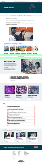


Redesigned website
Link to the live website
Please click on image to get redirected to live website*

Please note - since website is an ongoing project, It is continuously evolving and changing everyday. So some parts shown here might not be reflect the current website accurately.
Learning and challenges in project.
Learning
-
The biggest and greatest learning i got through project was about how a website of a consultancy and service organization works.
-
how website is maintained and how content on the website is created and managed.
-
What is CMS and how its designed and used for managing content.
-
Advocating for digital accessibility and learning more about digital accessibility was one of the biggest learning for me in this project. from the start of the process where i had to explain stakeholder what is accessibility and why its necessary to the end where getting website audited and certified from external agency.
- Green software foundation and sustainable design practices.
- Stakeholder management - Although in many previous project i had practiced and learned about this. Working side by side with an product owner was a new learning for me.
Challenges
-
One of the biggest challenges for this project came from the accessibility point of view. We always considered and called ourselves an inclusive organization. But for being inclusive, even after signing Fortune 500 pledge for inclusivity, our brand website itself was not digitally inclusive. Which was one of the biggest initiative. I had to personally learn and at the same time educate and mentor the team in accessibility practices.
-
Convincing business stakeholders about what accessibility is and why we need it was a real challenge.
- Another big challenge was stakeholder management. Even though there was a product owner in the team, due to organizational structure there was a different product owner for each and every section and subsections of the website. It created a unique situation where the design approval phase had to go through multiple rounds of discussions and the entire process tool a lot of time. We were able to improve on this in later sections by including the product owner of the section to work with us in the research phase itself, which resulted in less time lag at later phases.
- Another small but consistent challenge we faced in this project was about the branding. Since rebranding of the organization was done by a different team, there was little to no consideration was given to digital ui elements in branding and digital accessibility. Which created an issue for us, because every color, font or other elements we wanted to change needed to go through additional changes in the branding also. For example, if we find that two of the brand colors are not passing color contrast, and we need to use their shades then we had to collaborate with branding team and rework on entire branding.

